VICTOR QUATTRIN
Creative Director | Visual Storyteller | Brand Builder
Chevrolet — #technologyandstuff
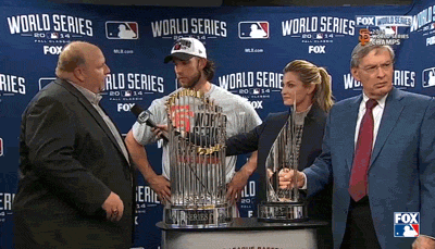
Turning a $5M PR Liability into a Global Cultural Asset.
At the 2014 Chevy Awards ceremony, a brand manager fumbled his product talking points live on stage and accidentally said "technology and stuff" in front of a national audience. Within hours, it was everywhere. The internet had a new villain.
Most brands would have gone dark, issued a statement, and waited for it to blow over.
We did the opposite.
Within 48 hours, I led a team that turned the gaffe into a fully deployed cultural campaign branded hashtag, social content, real-time media buys, and a narrative that reframed the moment from embarrassing slip to genuine brand personality. We didn't apologize for the human moment. We owned it.
The insight was simple: the internet wasn't laughing at Chevy it was paying attention to Chevy. That's the rarest thing a brand can have. The question was whether we had the speed and conviction to convert attention into something lasting.
We did.
67M+ organic impressions. No paid media required to start the fire only to sustain it. The campaign became a textbook case study in real-time creative leadership: the kind of work that only happens when a team has been trained to move fast without losing creative judgment.
This is the piece I'm most proud of; not because of the awards, but because of the decision. In a moment of crisis, we chose boldness. That choice is replicable. That's what I build teams to do.
Honors and Awards: Cannes Lions Gold / Rapid Response · Cannes Lions Silver / PR Crisis · Cannes Lions Bronze / Media · Clios Gold / Integrated · One Show / Interactive & Integrated · D&AD Wood Pencil / PR Best Response
Press: AutoWeek · Sports Illustrated · USA Today · CNN · LinkedIn
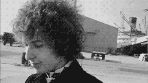
Bob Dylan Super Bowl — America's Import
The hardest creative brief is the one where you can't afford to be wrong.
Bob Dylan doesn't do ads. He has spent 60 years protecting his voice, his mythology, and his right to say no. When he agreed to appear in a Super Bowl spot for Chrysler, it wasn't just a media buy it was a cultural event. And it only works if the creative is worthy of the trust he extended.
That was the pressure in the room.
The brief wasn't "make a car commercial." It was "make something Bob Dylan would actually stand behind." Those are completely different creative problems. One is about selling features. The other is about earning the right to borrow one of the most singular voices in American culture without diminishing it.
The answer we found was to stop trying to make Chrysler sound like Dylan and instead let Dylan's worldview illuminate what Chrysler actually stood for. Not nostalgia. Not patriotism as wallpaper. A genuine argument about American craftsmanship, delivered by the one person whose credibility on that subject was unimpeachable.
The spot ran at Super Bowl XLVIII to 111 million viewers. Rolling Stone covered it. Bleacher Report covered it. Conan parodied it which is the cultural benchmark that matters most. You don't parody things that don't land.
Director Arnaud Uyttenhove brought a visual restraint that matched Dylan's tone unhurried, undecorated, confident. The craft on screen reflected the creative conviction behind it: we didn't need to oversell anything. The idea was strong enough to hold the silence.
What this piece proves: That I can handle the highest-stakes brief where the talent is larger than the brand, where the margin for creative error is zero, and where the work has to function as art before it functions as advertising.
Honors and Awards Cannes / Finalist · Archive Magazine / TV · D Show Best in Show
Press Rolling Stone · Bleacher Report · ABC News · Conan O'Brien Show
Director: Arnaud Uyttenhove / Caviar
Lumen — Brand Repositioning
The best creative problem isn't always on the brief. Sometimes it's in the room.
When I came onto the Lumen account, the creative relationship was broken. The client had stopped trusting the agency's judgment; which meant work kept getting watered down, briefs kept getting safer, and the brand kept getting smaller. That dynamic is a creative death spiral, and it doesn't get fixed by making better ads. It gets fixed by rebuilding trust first.
So before I touched a single brief, I focused on the relationship.
I got in the room. I listened to what they'd been frustrated by. I stopped presenting work as a creative authority and started presenting it as a partner trying to solve a real business problem. Slowly, the defensive posture on both sides dropped. And once the client felt heard, they became willing to be brave.
That's when the real work started.
The strategic problem with Lumen was fundamental: they were marketing a fiber internet brand the way everyone markets fiber internet speeds, specs, reliability claims that no one believes and no one remembers. The category was a commodity war fought entirely on rational ground.
The insight was simple and uncomfortable: nobody cares about your infrastructure. They care about what the connection makes possible. Joy. Work that flows. Kids who can learn. Creators who can create. The product is invisible when it's working so the brand had to live in the life around it.
We threw out the specs playbook entirely.
The result was a complete brand transformation new name (Quantum Fiber), new visual identity, new typography, new tone, new everything. The creative system we built wasn't a campaign. It was a new brand language designed to scale across every touchpoint and last for years.
3.1M impressions in the first three days. KPIs exceeded by 5x. And more importantly: a client who went from distrusting their agency to championing the work internally.
That last metric doesn't show up in any award submission. But for me it is an important one.
Honors and Awards Best of Show: Overall · Best Copywriting · Gold / Television · Gold / Radio · Gold / Integrated Campaign · Gold / Art Direction · Gold / Film Editing
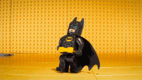
Lego Batman — Chevrolet Partnership
The Batmobile has always been a Chevy. We just reminded everyone.
Most people don't know this. The 1966 Batmobile the one that defined the icon for a generation was built on a Lincoln Futura chassis with Chevrolet components. Later interpretations carried Chevy engines and parts too. Batman and Chevrolet have a longer history together than almost anyone in the briefing room realized.
That historical truth became the entire foundation of the campaign. This wasn't a brand slapping its logo onto a movie partnership and hoping the cultural heat transferred. This was a legitimate creative argument: Chevy doesn't just sponsor Batman. Chevy powers Batman. Has for decades.
Once you have that insight, everything else gets easier and everything gets held to a higher standard because the idea is actually worth protecting.
The hardest part: making it feel like LEGO Batman, not like a car commercial.
Three IP holders. Three sets of brand standards. Three organizations with legitimate authority to change the work.
LEGO's visual logic is precise and proprietary the humor, the construction aesthetic, the specific way the LEGO Batman character speaks and moves. Warner Bros. was managing a global promotional machine around a major theatrical release with dozens of brand partners all competing for the same creative real estate. And Chevrolet needed its vehicles to show up as desirable, premium products not as props in someone else's movie.
Getting all three to feel like one seamless creative universe required constant advocacy and an almost obsessive attention to tonal consistency. Every frame, every line of copy, every social asset had to pass what we internally called the "LEGO-logic" test did it feel like something that actually existed inside that world, or did it feel like an ad that wandered in from outside it?
The answer had to always be the former. When it wasn't, we went back.
Then we built the Batmobile. For real.
A 1:1 scale LEGO Batmobile. Not a render. Not a prop. A full-size physical build that toured multiple locations giving audiences the chance to stand next to it, photograph it, experience it as an object in the real world rather than a digital asset on a screen.
That decision to build it physically rather than digitally is the same instinct behind the Steel vs. Aluminum bear. Real things land differently. A life-size LEGO Batmobile you can stand next to creates a memory. A CGI version in a video gets scrolled past.
The touring activation extended the campaign's footprint far beyond any single media buy — turning the Batmobile itself into a traveling piece of branded culture that kept generating attention everywhere it went.
The result: a multi-channel campaign across film, digital, social, print, outdoor, and experiential that felt genuinely native to the LEGO Batman universe at every touchpoint. Epica Gold for Product Integration which is the award that specifically recognizes when a brand partnership feels like it belongs rather than intrudes.
And a $300M+ global box office launch that Chevy was authentically part of — not just adjacently sponsoring.
What this piece proves: that I can operate inside some of the most complex creative and organizational constraints in the industry multiple IP holders, global launch timelines, competing brand standards and still deliver work that feels like it came from a single, coherent creative vision.
Honors and Awards Epica Gold / Product Integration · Cresta Silver / Promotions · One Show Merit / Print & Outdoor, Installations, Brand Entertainment · Cannes Lions Shortlist ×4 · New York Festivals Finalist ×4 · AICP Shortlist ×4 · AICE Best Visual Effects & Animation · Creativity Ad of the Day / Editor's Pick
Chevrolet — Silverado / Steel vs Aluminum
A direct competitive takedown disguised as a product demonstration.
In 2014, Ford made one of the boldest bets in automotive history: they switched the F-150 America's best-selling vehicle to an aluminum body. And they marketed it aggressively. Lighter. More efficient. The future of trucks.
Chevy had a different answer. Steel.
The brief wasn't to say aluminum was bad. It was to make steel feel inevitable to demonstrate, viscerally and memorably, that when something comes after your truck, you want the strongest material on earth between you and it.
So we put a bear in it.
Not a CGI bear. A real one.
This is the detail that changes everything about this campaign and the one most people get wrong when they see it. The bear in the cage is real. The people reacting are real. Their fear is real. We put actual people in a steel Silverado bed with an actual bear in an actual cage testing the actual strength of the actual truck.
That decision to do it for real instead of rendering it is what made the film land the way it did. You can feel the difference between a digitally composited animal and a living one. Audiences feel it too, even when they can't articulate why. The authenticity of the reaction is only possible because the situation was authentic.
Zach Merck directed with the restraint the idea demanded no overselling, no dramatic music swell, just the bear, the cage, the truck, and the very real faces of people processing what was happening to them.
Then we took the bear everywhere.
The film was the anchor. The campaign was the system built around it.
We brought a live bear in a steel cage to MLB baseball games placed it in high-traffic areas where fans could walk up, get close, and experience the demonstration firsthand. The bear became a traveling proof point. Not a mascot. Not a stunt for its own sake. A living, breathing argument for why steel matters.
On social, we built an amplification layer around the idea images of Silverado owners and their trucks alongside bear content, turning the campaign into a participatory platform. The territory we owned wasn't "truck commercial." It was the intersection of toughness, humor, and genuine demonstration a space no competitor could occupy because no competitor had the nerve to put a real bear in a real truck bed.
The competitive result was unambiguous.
Silverado became the top trending truck of 2015 on Google. Sales jumped 33.9% while Ford's numbers moved 4.8%. That gap — 33.9 vs. 4.8 — is the story. We didn't just win the creative battle. We won the market share battle, which is the only one that actually counts.
What this piece proves: that the most powerful creative decisions are often the ones that remove the safety net entirely. CGI would have been easier, cheaper, and safer. Real was better. Knowing the difference — and having the conviction to choose it — is a creative leadership call. This one paid off.
Honors and Awards: Cannes Lions Bronze / Activation · Cannes Lions Shortlist ×4 · Effie Bronze / Auto · LIA Silver / Social Media · LIA Bronze / Brand Content · New York Festivals 2nd Place / Branded · Creativity A-List Shortlist
Press: Adweek · CNN · USA Today · Sports Illustrated
Directed By: Zach Merck
College for Creative Studies — The Great Art Intervention
How do you sell art school to parents who are terrified of art school?
That's the real brief. Not "recruit students" students already want to come. The obstacle is the parent in the kitchen asking "but what will you do with that?" CCS needed to disarm that anxiety without being defensive about it.
The answer was to make the anxiety funny.
We looked at the visual language parents use to express fear about their kids' choices and found it already fully formed in the 1980s and 90s anti-drug PSA canon. The after-school special. The pamphlet on the refrigerator. The concerned neighbor. The ominous voiceover. Every parent who grew up in that era carries those references in their nervous system.
So we used them. Exactly. Shot for shot, tone for tone but instead of "your child might be using drugs," the warning signs were sketching in class, an unhealthy interest in sculpture, and staying up late to finish a painting.
The joke lands because the format is so familiar. And once the parent laughs, the defense comes down. That's when the real message gets in: your kid's passion for art isn't a crisis. It's a calling. And CCS is where it goes.
Why this piece belongs in an ECD book
This wasn't a big budget. It wasn't a Super Bowl. It was a small client with a real business problem and a team willing to find a genuinely unexpected solution. One Show Gold. D-Show Best in Show. BuzzFeed, Adweek, My Modern Met — earned media from outlets that don't cover car commercials.
I also taught senior portfolio at CCS for three years. So this wasn't just a client it was an institution I believed in enough to give my time to. The work reflects that. You can feel the difference between a campaign made for a client and a campaign made for something you actually care about.
I think that difference shows up in everything.
Honors and Awards One Show Gold · D-Show Best in Show · Radio Mercury Finalist
Press BuzzFeed · Adweek · My Modern Met · Great Ads
Chevrolet — Real People. Not Actors.
Not a campaign. A system. And it ran for nearly a decade.
When the automotive category was drowning in cinematic fantasy slow-motion on mountain roads, cars that nobody actually owned doing things nobody actually did the insight was almost uncomfortable in its simplicity: what if we just showed real people?
Not actors playing real people. Not influencers. Not curated "authenticity." Actual Chevy owners, in actual Chevy dealerships, reacting to cars they didn't know were made by the brand they already owned. Unscripted. Unrehearsed. Unpolished in exactly the right ways.
The category had spent decades telling people what to feel about cars. We let the cars speak for themselves through the faces of people who already loved them.
What made this hard wasn't the idea. It was the discipline.
Any agency can sell an unscripted concept once. The challenge is maintaining the creative integrity of that idea across hundreds of executions, dozens of shoots, multiple years, and the constant institutional pressure to make it "a little more produced." Every season there were conversations about adding music beds, smoothing the reactions, scripting the reveals. Every season we held the line.
That discipline is what turned a campaign into a platform. And that platform is what drove results no one expected to sustain for as long as they did.
38 consecutive months of year-over-year sales growth. Car sales up 32%. Truck sales up 24%. Brand opinion up 16 points. Consideration up 12 points. Effie wins across four consecutive years which is the award specifically designed to measure whether creative work actually moves business.
It did.
What this piece proves: that I can build a creative system with enough structural integrity to outlast any individual execution and enough internal conviction to protect it when the pressure to compromise comes. And it always comes.
Honors and Awards One Show / Creative Effectiveness / 2020 · Effie Bronze / Brand Renaissance / 2019 · Effie Finalist / 2018 · Effie Bronze / Automotive / 2017 · Effie Finalist / 2016
Director: Zach Merck
The Barbie — Dream EV
We didn't make a car commercial. We made a life-size toy.
The Barbie movie was going to be the cultural moment of 2023. That much was clear months before release. The question for Chevy wasn't whether to be part of it it was whether they could find a way in that felt genuinely native to the Barbie universe rather than bolted onto it.
The insight that unlocked everything was hiding in Barbie's history: she's been driving electric Corvettes since the 1970s. She wasn't jumping on the EV trend. She was the original early adopter. That's not a marketing angle that's a true thing. And true things are the only foundation worth building on.
From there, the idea was immediate: don't make an ad. Make a toy.
A 1:1 scale Blazer EV. A full-size classic Mattel toy box. On the pink carpet. A life-size version of something every person who's ever opened a Barbie box would recognize instantly — except real, and drivable, and Chevy's.
The part that doesn't show up in the recap: making it happen.
The execution required navigating one of the most complex IP environments in advertising simultaneously managing the creative constraints of Mattel, the promotional architecture of Warner Bros., and the brand standards of Chevrolet, all while keeping the idea intact through every approval layer.
Every major IP holder protects their asset differently. Mattel's relationship with the Barbie aesthetic is meticulous color codes, logo placement, the specific visual logic of the packaging. Warner Bros. was running a global promotional machine with dozens of brand partners all competing for the same real estate. Getting Chevy's activation to feel like it belonged rather than just paid to be there required constant creative advocacy at every level of both organizations.
The job wasn't just directing the work. It was protecting the idea through a gauntlet of stakeholders who all had legitimate authority to change it. That's a different skill than concepting. It's the one that determines whether great ideas actually make it into the world.
They did. The toy box hit the pink carpet. 100M+ viewers worldwide. A car launch embedded at the center of a billion-dollar cultural phenomenon and not a single frame of it felt like a car commercial.
The Reach: 100M+ viewers worldwide The Result: Blazer EV positioned as the cultural EV of the year without a single product-spec message
Warrior "Cross The Line" — Brand Platform Originator
The best taglines aren't clever. They're true.
Warrior had an identity problem. Not an awareness problem athletes in lacrosse, hockey, and soccer knew the brand. The problem was that the edge that built Warrior's reputation had gone soft. The gear had kept up. The brand voice hadn't.
Warrior was never supposed to be the safe choice. It was the brand for the athlete who plays on the wrong side of the line who bends the rules, pushes the limits, does whatever it takes to win. The rebel on the field. The one the other team hates to play against and secretly wants to be.
That identity needed a voice again.
The insight was already in the sport.
Every game Warrior touches has a line you have to cross to score. The crease in lacrosse. The goal line in hockey. The end line in soccer. Crossing the line isn't just a metaphor for this brand; it's the literal act of winning. And for Warrior's athlete, it's also a personality. They cross lines on the field and off it. They don't ask permission. They don't play it safe.
Cross The Line works because it operates on every level simultaneously as a competitive statement, as a brand attitude, and as a literal description of how you win the game. That's what makes a tagline last. Not cleverness. Not wordplay. The fact that it's simply, undeniably true about the brand and the people who wear it.
Fifteen years later, it still is.
What this piece proves: that brand platform thinking isn't about finding a catchy line it's about finding the one true thing a brand owns and giving it language precise enough to last. Most taglines are retired in two years. This one became part of the brand's DNA.
Chevy Silverado — 100 Years of Dependability
The hard part: making 1918 and 2018 live in the same frame.
The transition between archival and modern footage sounds simple until you're in the grade trying to make it work. Archival film has grain, color temperature, aspect ratio, and a visual texture that is incompatible with modern high-definition cinematography: unless you approach the problem from both ends.
That meant two things happening in parallel. On the creative direction side: decisions about which archival moments to match with which modern ones, which transitions earned a hard cut versus a dissolve, and where the emotional weight of the past needed to breathe before the present could enter the frame. On the technical side: color work that didn't smooth the archival footage into something it wasn't, grain matching that felt intentional rather than corrective, and an edit precise enough that the transition between eras felt inevitable rather than constructed.
The temptation in that process is always to cheat toward the modern to clean up the archival footage until it plays nice with the HD material. We resisted that entirely. The texture of the past was the point. The contrast between eras wasn't a problem to solve. It was the idea.
The scale.
This wasn't a single spot. It was a cross-platform wall of heritage TV, cinema, social, print, OOH, and digital, all rolling out simultaneously, all maintaining the same visual and tonal consistency. The creative direction challenge at that scale isn't just making great individual executions. It's ensuring that someone who sees a print ad on a Tuesday and a cinema spot on a Saturday feels like they're inside the same world both times.
D-Show Best in Show. One Show Merit for Moving Craft. ADC Bronze. Multiple craft awards across editing and cinema at the Clios, Cresta, and LIA. The industry recognized it as a craft benchmark: which it was. But the more important recognition was from the audience: a centennial campaign that reinforced Chevy's position as the most dependable truck on the road without ever feeling like it was trying to.
That's the hardest thing to pull off in heritage work. Making the past feel like a reason to believe in the future, not a reason to feel sentimental about it.
What this piece proves: that I understand craft at a technical level not just what looks right, but why it looks right and what decisions in the grade, the edit, and the color work produce that feeling. Creative direction that stops at the concept and delegates the rest isn't creative direction. It's ideation. The work lives in the details all the way through finishing.
Honors and Awards D-Show Best in Show · One Show Merit / Moving Craft · Art Director's Club Bronze / Television · Art Director's Club Merit / Editing · Clios Shortlist / Video · Cresta Bronze / Cinema · LIA Bronze / Editing · New York Festivals 2nd Place / Craft
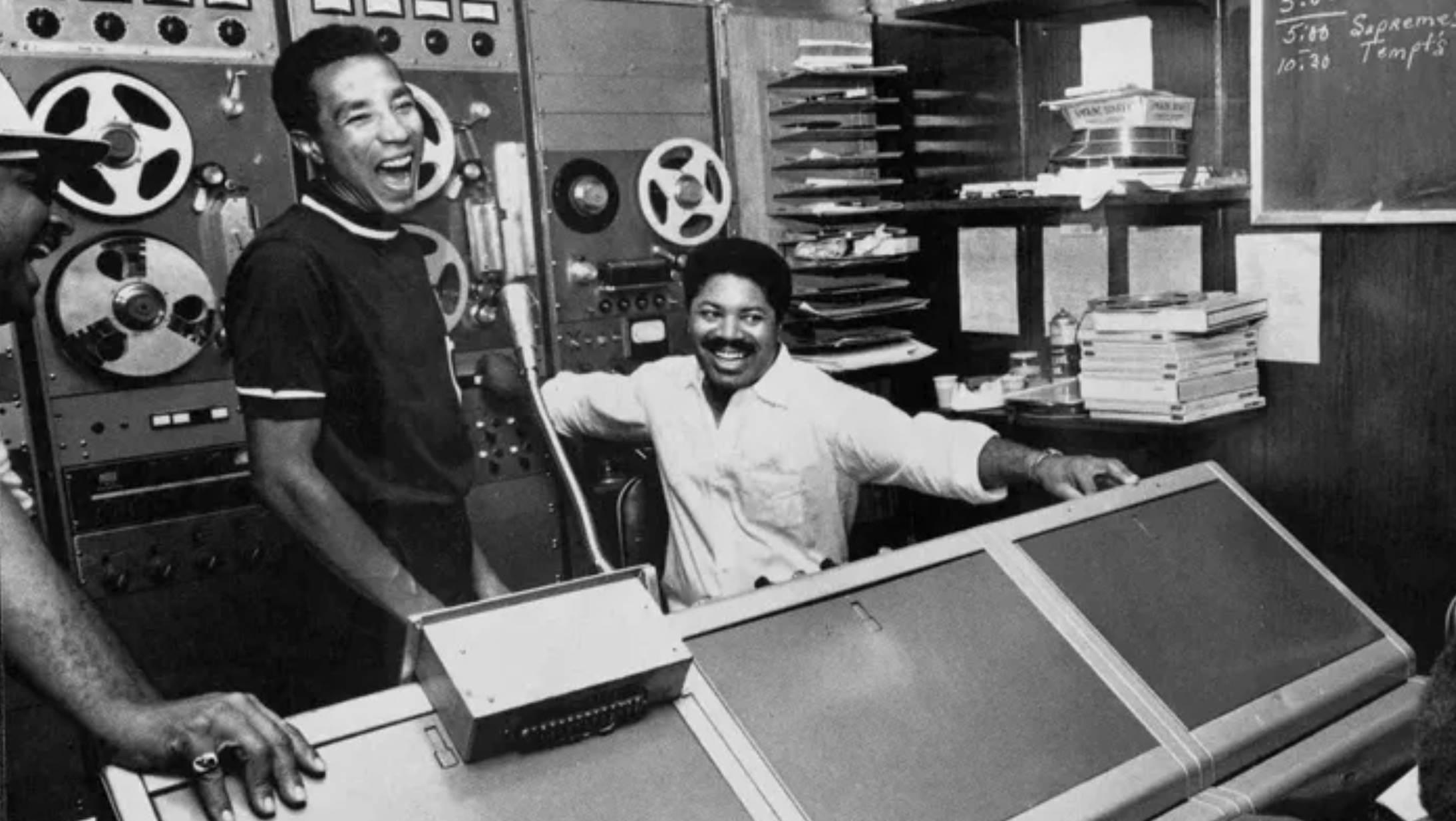
Motown Museum — Writing for an American Icon
The most important brief isn't always the biggest budget.
There's a building on West Grand Boulevard in Detroit where American music changed forever. Where Berry Gordy built a recording studio in a house, called it Hitsville U.S.A., and over the next decade produced a catalog that defined soul, R&B, and popular music for generations. The Supremes. Marvin Gaye. Stevie Wonder. The Four Tops. The Temptations.
That's the client. That's the brief.
When the Motown Museum came to us, the challenge wasn't awareness everyone knows what Motown is. The challenge was relevance. How do you make a museum feel urgent and alive to an audience that experiences music through a phone rather than a record player? How do you honor something sacred without making it feel like a relic?
The answer was to write radio that felt like the music itself emotionally direct, rhythmically precise, and completely unpretentious about its own importance.
Why radio was the right medium.
This wasn't a default. It was a deliberate creative choice and the most appropriate one available: Motown was built on sound. The stories that matter most about that building on West Grand Boulevard are sonic ones what it sounded like when the Funk Brothers laid down a track, what it felt like to hear a finished record for the first time, what Berry Gordy heard in a voice that nobody else heard yet.
You can't photograph that. You can't art direct it. You can only write it and trust the writing to do what Motown's music always did: make you feel something before you've had time to think about it.
That's the standard we wrote to.
The work.
Four Radio Mercury Award finalists. Two D-Show wins. For a Detroit institution, written by a Detroit creative, using the medium the brand was born in.
The "Born" spot approached the origin story not as history but as inevitability the feeling that something this significant couldn't have started anywhere else or any other way. "Motown Museum" used the building itself as the character, the rooms as the narrative, the silence between the notes as the emotional weight. "Play Motown" made the argument for why the music still matters now not as nostalgia, but as the original blueprint for everything that came after it.
What this piece proves: that creative leadership means knowing which medium serves the idea not defaulting to the biggest production or the most visual format. Sometimes the most powerful creative decision is choosing the constraint. A blank page, a voice, and sixty seconds. If the writing is right, that's enough.
It was enough for Motown. It should be enough for anyone.
Honors and Awards Radio Mercury Award Finalist ×4 — "Born," "Motown Museum," "Play Motown," "Play Motown / Creative Use of Sound" · D-Show — "Born" · D-Show — "Play Motown"
Silverado — Magazine Stand Hijack
We didn't buy ad space. We collaborated with the editors.
Most magazine advertising works like this: the brand buys the page, the agency makes the ad, and the editorial team makes sure it doesn't look too much like their content. The wall between advertising and editorial is deliberate, protected, and almost never crossed.
We crossed it.
To launch the all-new Silverado, we went directly to the editorial teams at some of America's most iconic publishers and asked a different question than anyone had asked them before: not "can we buy your back page" but "can we make something together that actually belongs in your magazine?"
The answer, remarkably, was yes.
What "editorially native" actually meant.
The concept was straightforward and almost unprecedented in practice: every execution would be built in genuine collaboration with each magazine's editorial team, using their visual language, their typography, their layout conventions, and their subject matter expertise with the Silverado integrated as a natural part of the story rather than an interruption of it.
For a science publication, that meant a technical breakdown of the Silverado's engineering that could have run as editorial content — precise, detailed, visually systematic. For an outdoors title, it meant photography and layout that matched the magazine's specific visual texture — the way they shoot landscape, the way they crop, the way they let the environment do the heavy lifting. For a lifestyle publication, it meant something else entirely.
The creative challenge wasn't making a great ad for each magazine. It was understanding each magazine's editorial identity deeply enough to make something that felt like it came from inside rather than outside and then doing that simultaneously across an entire newsstand.
That's a different kind of creative leadership. It requires cultural fluency across multiple audiences, the organizational ability to manage parallel creative relationships with multiple editorial partners, and the conviction to let each execution look genuinely different while still functioning as one coherent brand statement across the full takeover.
The result.
When the campaign ran, the Silverado was everywhere on the newsstand simultaneously but nowhere did it feel like a takeover. It felt like the Silverado had somehow become part of the cultural conversation of every publication at once. Not an advertiser. A participant.
That's the distinction the industry recognized. Communication Arts Award of Excellence is one of the most rigorous design credentials in the business — it's judged on craft and concept equally, and it doesn't go to work that simply looks good. It goes to work that advances the form. D-Show Best of Print confirmed it from the advertising side.
Traditional media still has stunt-level power. But only when it's used with the kind of architectural thinking that treats the medium itself as the creative opportunity not just the container for the message.
What this piece proves: that I can identify creative opportunities that live outside the conventional brief in this case, the relationship between advertising and editorial and build the organizational partnerships required to execute them. The idea was simple. Making it real required going somewhere most agencies never go.
Honors and Awards 2019 Communication Arts Award of Excellence · 2019 D-Show Best of Print
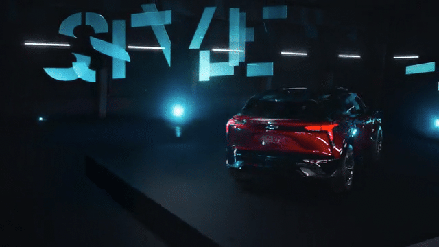
Chevrolet — Digital Blazer EV Pre-Launch
Every other EV launch looked like a screensaver. We built something real.
Look at the EV launch landscape in 2022 and you see the same visual language repeated endlessly: sleek CGI renders, neon light trails, cars floating through digital environments that don't exist, set to music that sounds like the future as imagined by a algorithm. Cold. Frictionless. Unconvincing.
The category had collectively decided that the way to sell an electric future was to make it look like science fiction. We decided the opposite.
The insight that drove everything: digital futures feel distant. Practical ones feel inevitable. If you want someone to believe in a vehicle they've never driven, the worst thing you can do is show them something that looks like it was made by a computer. The best thing you can do is show them something they could reach out and touch.
So we built things. Real things. Large-scale physical sculptures, geometric sets, modular environments constructed from actual materials designed specifically to showcase the Blazer EV's design language in a way that felt permanent and deliberate. Not a render. Not a composite. A car occupying a real space in the real world, photographed the way you'd photograph a work of art.
What we were fighting against.
This decision was a fight on every front simultaneously and that's worth being direct about, because the creative conviction only means something if you understand what it cost to hold it.
The client pressure was real. Every competitor was doing CGI. The category template existed for a reason digital production is faster, cheaper, more controllable, and carries essentially zero risk of something going wrong on a practical set. Asking a client to spend more money, take more time, and accept more production risk in order to do something that looked deliberately less polished than the competition requires a very specific kind of creative argument. Not "trust us." But "here's exactly why real lands differently than rendered, and here's what it will feel like when it does."
The internal pressure was equally real. Practical builds at this scale are genuinely hard. Sets need to be designed, engineered, and constructed. Physical environments need to be lit for a vehicle that has never been photographed at scale before. Every problem that CGI would solve invisibly becomes a real problem that needs a real solution on the day.
And the category pressure was perhaps the hardest to overcome because when everyone in your competitive set is doing the same thing, the instinct is to assume they're right. The EV visual language had calcified into CGI renders because that's what EV launches looked like. Breaking from that pattern required not just creative conviction but the ability to articulate clearly why the pattern was wrong.
We held the line on all three fronts.
Director Ben Tricklebank brought a visual intelligence to the practical sets that elevated them from production design to genuine art direction. His instinct for how light interacts with physical geometry — how shadow defines a surface, how a real material catches light differently than a rendered one — was exactly what the idea needed. The collaboration was less "director executes brief" and more "two people solving the same visual problem from different angles."
The sets themselves became part of the story. Behind-the-scenes content showing the builds resonated with design-conscious audiences and craft-watchers in a way that no CGI breakdown ever could because watching something real get made is inherently more compelling than watching something digital get rendered.
The result was a pre-launch campaign that positioned the Blazer EV as a premium, design-forward vehicle before a single spec had been announced purely through the visual conviction of how it was presented. The practical approach drove significant engagement across digital and social, and built the kind of anticipation that a glossy render rarely generates.
More importantly, it felt like Chevy. Not like a tech company. Not like a concept car. Like a vehicle built by people who believe that real things matter.
What this piece proves: There is a consistent creative philosophy running through my work from a real bear in a real truck bed to a life-size LEGO Batmobile to archival footage that refuses to be cleaned up to physical sets built instead of rendered. Real things land differently. That conviction costs something every time — in budget, in time, in organizational resistance. And it pays off every time for the same reason: audiences feel the difference between something made and something generated, even when they can't articulate why.
That philosophy doesn't change with the brief. It's just applied differently each time.
Honors and Awards: Engagement at scale across digital and social · Significant pre-launch awareness and consideration lift for Chevy EV lineup
Director: Ben Tricklebank / Punk & Butler
From the War Room to the Sound Stage
Most creatives live at one end of the spectrum. I work across all of it.
There are two kinds of creative problems. The kind that need to move in 48 hours a cultural moment, a crisis, a window that closes before the brief is even written. And the kind that need nine months a Super Bowl platform, a centennial campaign, a brand evolution that has to hold together across five directors, four formats, and a hundred individual executions.
Most creative leaders are built for one or the other. Fast and instinctive, or slow and architectural. I've spent 18 years being both sometimes on the same account in the same quarter.
That range is what this piece is about.
The scrappy end: concepting at speed
The #technologyandstuff campaign went from cultural moment to deployed creative in under 48 hours. No pre-production. No director. No safety net. Just a team that had been trained to move fast without losing creative judgment and a leader who could make the call in the room and back it with conviction when the client needed to be sold on boldness in real time.
That kind of work requires a different creative muscle. It's not about the perfect idea. It's about the best idea available right now, executed with enough craft to hold up, and sold with enough clarity that everyone moves in the same direction immediately.
I love that work. The constraint is the creative.
The large scale end: directing across a system
On the other end: building a 90-day production system with Rupert Sanders — director of Snow White and the Huntsman and Ghost in the Shell — designed to capture a modular asset library that could sustain a consistent high-craft visual language across TV, social, and digital simultaneously.
That's a completely different problem. The challenge isn't speed it's coherence. How do you maintain one brand voice across five world-class directors, each with their own aesthetic, their own instincts, and their own very specific ideas about how a shot should feel?
The answer is creative leadership that's present at every stage not just in the concept room, but in the casting session, the location scout, the grade, the mix, and the final cut. You can't set a visual direction in a brief and then show up at the premiere and hope it held together. You have to be the through line.
The directors — and what each one brought
Working with directors at this level isn't a credential. It's a creative relationship — and managing those relationships while protecting the brand vision is one of the least-discussed and most important skills an ECD needs.
Rupert Sanders brings a cinematic scale and visual architecture that makes a brand feel like a world, not a commercial. The challenge with Rupert is staying in the frame creatively — his instincts are strong and his vision is specific. The job is knowing when to let him run and when to pull back to the brand.
Brian Buckley is the best finder of human soul in a mundane moment working today. "Mom, Video Game" works because Buckley finds the thing underneath the thing — the unspoken emotional stakes inside a scene that looks ordinary on the surface. Your job as the creative director in that room is to create the conditions for that to happen and then not get in the way of it.
Jim Jenkins is a comedy director who makes it look effortless — which means the work is actually extremely precise. Comedy at the brand level lives or dies in the edit, and Jenkins understands that better than almost anyone. Working with him requires a specific kind of creative confidence: you have to trust the instinct, not over-direct, and know when the funny thing in the room is better than the funny thing in the script.
Rachel McDonald brought a visual poetry to "Safe Place" that reframed what safety means as a brand idea — not a feature, not a spec, but a feeling. That kind of emotional precision requires a director who thinks in images before words, and a creative leader who can brief that direction without over-explaining it into something literal.
Lloyd Lee Choi is a forward-thinker — his work on "Future Flashes" bridged the brand's heritage with its tech-driven future in a way that felt earned rather than aspirational. The creative challenge there was holding the tension between where Chevy had been and where it was going without letting either side collapse into the other.
Five different directors. Five different creative temperatures. One brand voice across all of it. That's the production leadership challenge — and it's one I'd put against anything in the industry.
The craft: beauty, comedy, music, and the final mix
What gets lost in the case study format is how much of the final work lives in the finishing. A beauty film lives or dies in the grade. A comedy piece lives or dies in the edit timing is everything, and one frame in the wrong direction kills a joke that worked perfectly on set. A brand platform lives or dies in the music whether you're clearing a track, briefing a composer, or mixing a final sound design, those decisions shape how the audience feels about the work before they've consciously processed a single frame.
I've been in those rooms for all of it. Not as an observer as the creative decision-maker who knows what the work needs to sound like, look like, and feel like before the final output exists. That's the difference between a creative director who leads the concept and an executive creative director who leads the work all the way through.
The concept is the beginning. The mix is the last creative decision. Everything in between is leadership.
What this piece proves: that I can operate at every point on the creative spectrum — from a war room where the brief is written in real time to a sound stage where the margin for error is measured in frames. The range isn't accidental. It's built. And it's available on every brief.